By Pink Realty
Colorado Springs offers a backdrop unlike almost anywhere else in the country. The Pikes Peak region delivers shimmering natural light that shifts dramatically across seasons, from the crisp, blue-toned winter sun to the warm amber light of late summer afternoons.
Those dynamics affect how paint colors read on the walls in your Colorado Springs home. A color that looks perfectly sophisticated in a showroom might read completely differently once it meets the light pouring through your south-facing windows at 6,200 feet of elevation. Understanding color psychology means understanding not only what colors do to the human mind in the abstract but how they perform in your specific home and climate.
Whether you are preparing to sell soon and want to maximize your home's appeal or you simply want your spaces to feel more intentional and livable, this guide walks you through the foundational principles of color psychology and how to apply them room by room.
Key Takeaways
-
Color psychology is the study of how hues affect mood, perception, and behavior, and it applies directly to how your home feels to live in and to potential buyers.
-
The intense natural light in Colorado Springs and the surrounding region affects how paint colors read, making it essential to test samples on your walls before committing.
-
Warm, cool, and neutral palettes each serve different purposes; the best approach is to layer them intentionally rather than selecting one color for an entire home.
-
Specific rooms benefit from specific color strategies: bedrooms favor calming tones, kitchens respond well to energizing hues, while living areas tend to work best with grounded, versatile neutrals.
-
A thoughtfully chosen color palette can influence how quickly your home sells and how buyers perceive its value.
What Color Psychology Actually Means for Your Home
Color psychology is sometimes dismissed as a soft concept, but the research behind it is substantial. Colors influence cortisol levels, heart rate, and perceived room temperature. They affect how spacious or inviting a room feels, how high or low the ceilings appear, and whether a room invites people to stay or signals them to move on. For homeowners, this means that every color decision is also a decision about how you and your guests will feel in each space.
The basics break down along the warm-cool spectrum. Warm colors, including reds, oranges, and yellows, stimulate the nervous system and create a sense of energy and intimacy. Cool colors, from blues and greens to soft violets, do the opposite: they lower perceived temperature, promote calm, and make spaces feel more expansive. Neutrals, which include whites, taupes, greiges, and warm grays, are between these two ends of the spectrum and are often the most strategically flexible option in a real estate context.
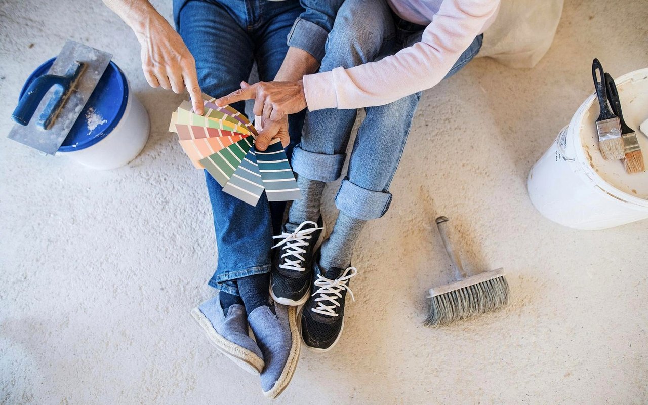
What complicates this in a setting like Colorado Springs is the altitude and light. At high elevation, natural light has a higher UV index and a different color temperature than at sea level. Colors can look more saturated in bright conditions and dramatically different on overcast days. This is why local designers consistently advise testing paint samples over a 48-hour period before committing; what you see in the store or on a screen is seldom what you will see on your walls.
The basics break down along the warm-cool spectrum. Warm colors, including reds, oranges, and yellows, stimulate the nervous system and create a sense of energy and intimacy. Cool colors, from blues and greens to soft violets, do the opposite: they lower perceived temperature, promote calm, and make spaces feel more expansive. Neutrals, which include whites, taupes, greiges, and warm grays, are between these two ends of the spectrum and are often the most strategically flexible option in a real estate context.
What complicates this in a setting like Colorado Springs is the altitude and light. At high elevation, natural light has a higher UV index and a different color temperature than at sea level. Colors can look more saturated in bright conditions and dramatically different on overcast days. This is why local designers consistently advise testing paint samples over a 48-hour period before committing; what you see in the store or on a screen is seldom what you will see on your walls.
Color Vocabulary Worth Knowing
-
The “hue” refers to the pure color itself (blue, red, green) before any lightening or darkening occurs.
-
“Saturation” describes how vivid or muted a color is; high saturation reads as bold, while low saturation reads as soft or sophisticated.
-
“Value” refers to how light or dark a color is, with lighter values making spaces feel larger.
-
“Undertones” are the subtle secondary colors within a neutral, such as the pink in a beige or the green in a gray, which become visible when placed next to other colors.
-
“Color temperature” describes whether a hue reads as warm or cool, which directly affects how a room feels physically and emotionally.
Color Strategies for Colorado Springs Homes
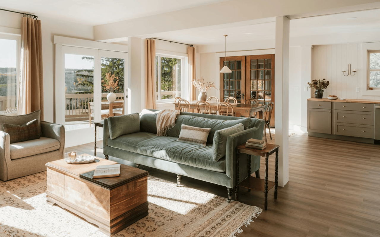
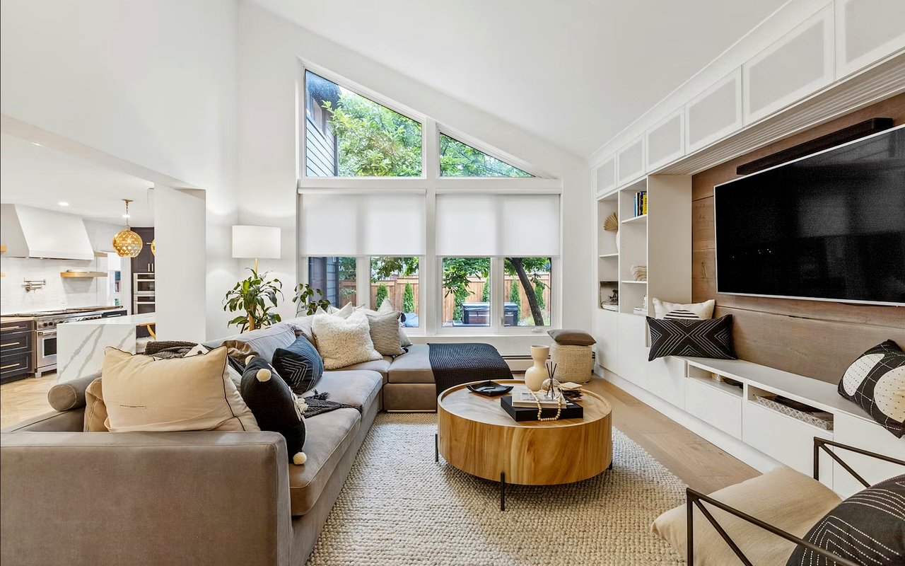
Applying color psychology effectively means treating each room as its own environment with its own functionality. A single color palette through every room rarely creates the effect homeowners are hoping for. The most livable homes leverage color strategically, shifting the emotional register from room to room based on how each space is actually used.
Bedrooms almost universally benefit from cool, desaturated tones. Soft blues, muted sage greens, and lavender-adjacent hues have all been shown to reduce cortisol and support better sleep quality. In a bedroom, a visually restful environment makes a real difference. Avoid highly saturated versions of colors; the goal is quiet, not cold.
Kitchens and dining rooms respond well to warmer tones because those spaces are associated with appetite, conversation, and social energy. Soft terracottas, warm whites with yellow undertones, and muted golds all perform well in Colorado's abundant daylight without feeling overwhelming. If your kitchen receives significant afternoon sun, be cautious with deeply saturated warm colors; they can tip into overstimulation by late in the day.
Color Choices That Work Well by Room
-
Bedrooms: soft sage, dusty blue, warm white, and muted lavender all support rest and visual calm.
-
Kitchens: warm white, creamy off-white, light terracotta, and pale amber work with the region's natural light without washing out.
-
Living rooms: greige, warm taupe, earthy green, and soft charcoal offer versatility across seasons and lighting conditions.
-
Home offices: medium blue, olive green, and soft warm gray promote focus without the stimulation of a brighter palette.
-
Bathrooms: pale aqua, soft white, and muted sage read as clean and spa-like without requiring expensive finishes to look intentional.
Working With Light in the Pikes Peak Region
One of the most important variables in any color decision in your Colorado Springs home is the direction your windows face and how much natural light each room receives at different times of day.
North-facing rooms receive cooler, more consistent light and often need warmer paint tones to avoid reading as dim or unwelcoming. South-facing rooms get the most intense and warm light, which means that colors can look more saturated than expected. East-facing rooms are bright in the morning and shift to shadow in the afternoon; west-facing rooms reverse that pattern.
At altitude, the quality of light is also simply more intense. Colors that look muted at sea level can vibrate at elevation. This is particularly true for high-saturation colors in the warm spectrum; an orange that feels inviting in a showroom can feel jarring in your living room. The fix is almost always to step down in saturation rather than shift in hue.
Test Colors Before You Commit
-
Purchase sample jars and paint 12-by-12-inch swatches directly on the wall you plan to paint.
-
Observe each swatch at multiple points during the day: morning light, midday, late afternoon, and under artificial evening light.
-
Pay attention to how the color interacts with your flooring, trim, and any fixed finishes like countertops or tile.
-
Compare swatches next to each other on adjacent walls to identify undertone conflicts.
-
If your home receives significant natural light, lean toward a lighter value of your chosen color than you think you need.
FAQs
What Paint Colors Are Most Popular in Colorado Springs Homes?
Warm whites, greiges, and sage greens have dominated Colorado Springs interiors over the past several years, largely because they work well with the region's natural light and complement the mountain-adjacent aesthetic many homeowners are drawn to. Soft blue-grays and earthy terracottas also appear frequently, particularly in newer construction and remodeled homes. The overall trend leans toward colors that feel grounded and nature-connected rather than stark or ultramodern.
How Does Altitude Affect How Paint Colors Look?
At higher elevations, natural light has a different color temperature and higher UV intensity than at sea level. This means that colors can appear more saturated, especially in rooms with significant south-facing exposure. Colors that look subtle in a showroom or on a paint chip can read as more vivid once applied. Testing samples on your actual walls over a full day is especially important.
Should I Paint My Home Before Listing It in Colorado Springs?
In most cases, yes. Fresh paint in a buyer-friendly palette is one of the highest-return investments you can make before listing. It signals that the home has been well-maintained, makes photography look sharper, and helps buyers envision themselves in the space. Sticking to a neutral but warm palette rather than highly personalized colors gives you the broadest possible appeal.
How Often Should I Repaint the Interior of My Home?
Most interior paint in a well-maintained home holds up for seven to ten years before needing a refresh. However, high-traffic areas like hallways, kitchens, and around door frames often show wear sooner. If you are preparing to sell, a full interior repaint in a current, neutral palette is typically worth the investment.
Make Every Room Feel Like It Was Designed That Way
Color is one of the few factors in your home that you can change without a contractor, a permit, or a significant budget, and yet its effect on how a space feels is profound.
In Colorado Springs, where the natural environment is such a dominant presence, the most successful interiors tend to be the ones that work with that light rather than against it. Whether you are refreshing a single room or preparing your entire home to list, approaching color with intention rather than impulse consistently produces spaces that feel more cohesive, more livable, and more compelling.
If you are ready to explore what a more intentional color strategy could do for your Colorado Springs home before listing, our team at Pink Realty is here to help. Reach out, and let's talk through what is possible.